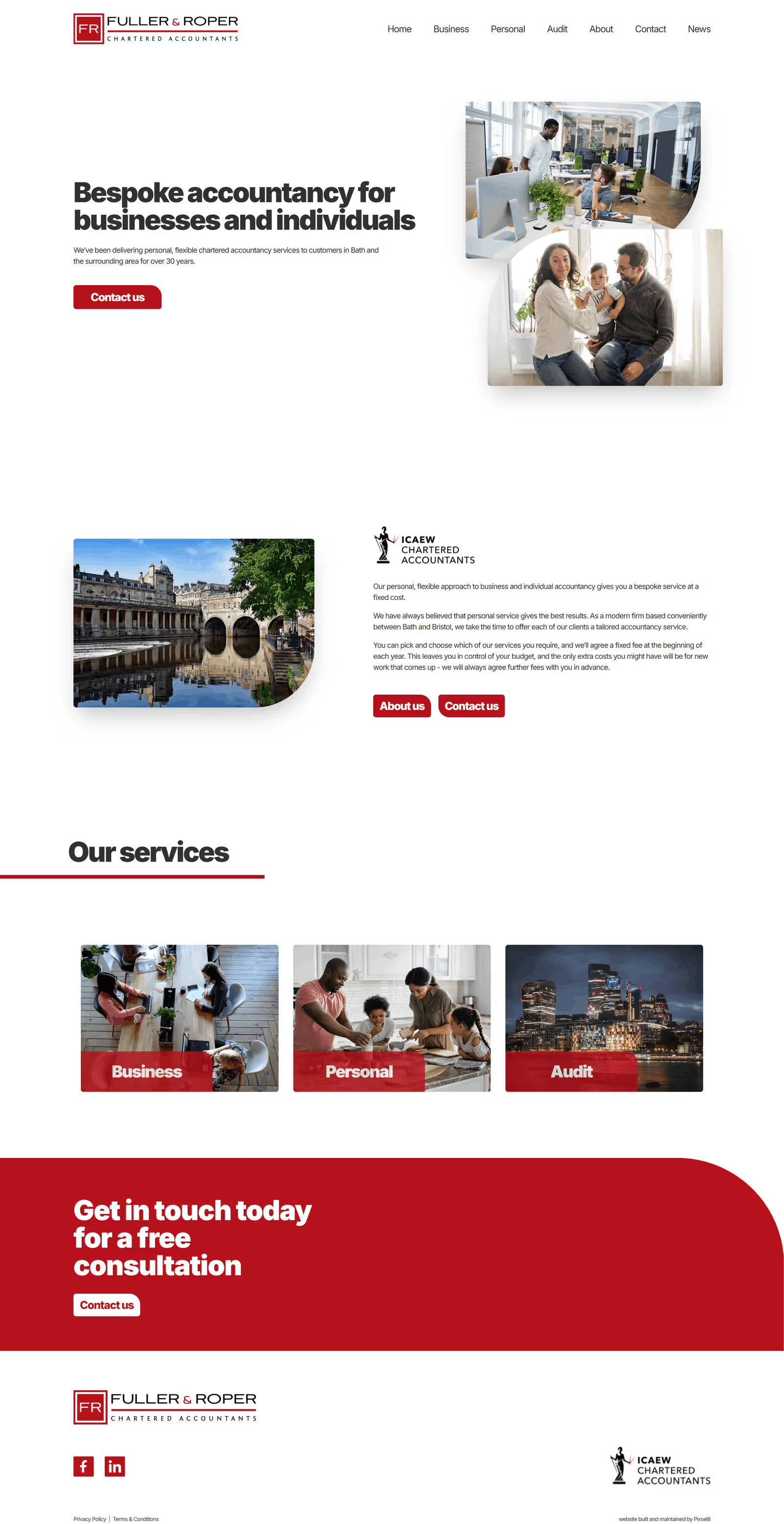

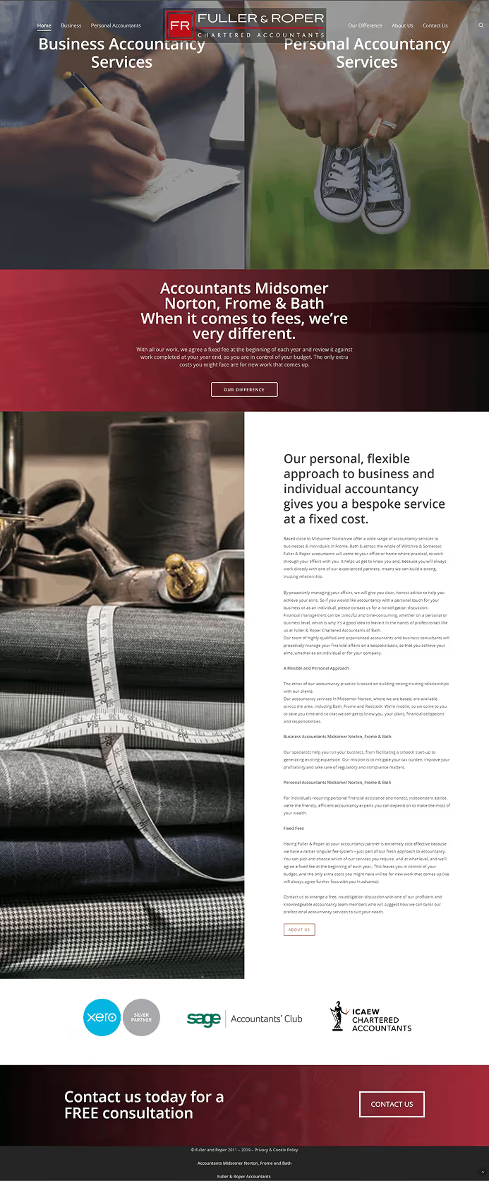
Having delivered chartered accountancy services to customers in Bath and the surrounding area for over 30 years, Fuller & Roper has built a reputation for a personal, flexible approach to accountancy for both businesses and individuals that has seen the business flourish. With a brand built on their professionalism and expertise, they became concerned that their existing website had become misaligned with that image due to a lack of cohesion in both the content and presentation. They felt that the content on the website had become focused on SEO optimisation to the detriment of it's actual purpose: informing and attracting potential clients. With the amount of text on the site having gradually increased over time, it had also begun to impact the aesthetics and made some of the original design choices seem ill-advised. When we sat down to discuss the redesign of the site it became clear that the main aim was to improve the user experience, both by making the content more focused on the services they provide, and by making the site more aesthetically coherent.
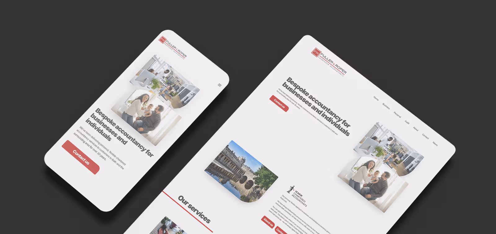
We began the process with a fair amount of research. We wanted to have a good understanding of the industry and Fuller & Roper's competitors in order to best assess what would make them stand out from the rest. (Yes, we also do poetry here at Pixsel8, that's why we're great) We knew that in an industry like accounting, users would probably expect a professional, understated website and that less would be more to a certain extent. However, we felt that adding some small animations to the pages would give a more engaging and visually appealing experience, whilst maintaining a more conservative page structure would keep the site aligned with it's users' expectations. Fuller & Roper wanted the site to appeal to individuals and businesses of various sizes, so it needed to look somewhat 'corporate' but not so much that it alienated potential personal accountancy clients and very small businesses. It was a tricky proposition from a design point of view, and an interesting challenge for us. The way we decided to approach this was to have a somewhat minimalist look and feel to the site with plenty of white space to give it a clean, almost clinical style, but then use rounded corners on all of the images and buttons in order to give a slightly more welcoming, warm tone.
As for performance, we decided to build the new site using Gatsby, a modern static website framework known for its lightning-fast performance, strong SEO foundations, and enhanced security. This not only improved loading times and overall user experience but also ensured the site was highly scalable and easy to maintain as the business grows.