
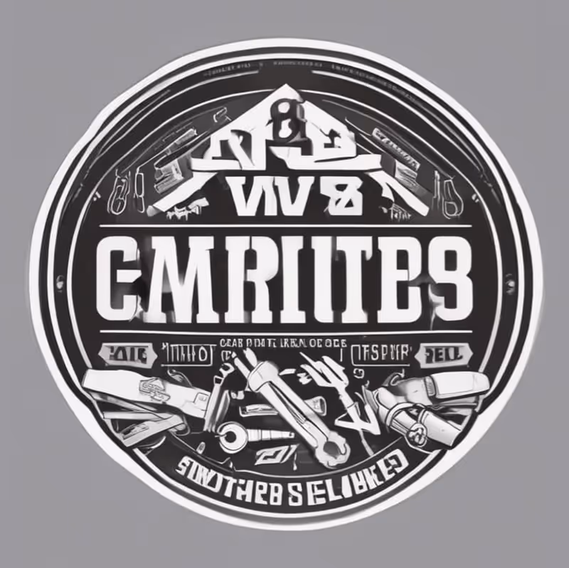
GoWells Construction had experimented with AI to create a starting point for their logo. While the generated design included construction-themed elements, it lacked hierarchy, legibility, and brand clarity. The typography was inconsistent, the detailing was overly busy, and the overall mark did not feel polished or professional enough to represent a growing construction company.
Another key issue was differentiation. The construction industry is saturated with logos that rely on predictable house rooflines and generic builder icons. GoWells wanted something that would stand out from competitors - something recognisable and bold, but without losing a clear connection to the building trade.
The challenge was to take the creative spark from the AI draft and transform it into a refined, distinctive logo that would work in real-world applications.
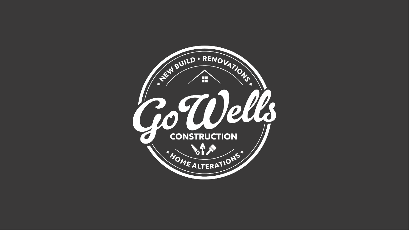
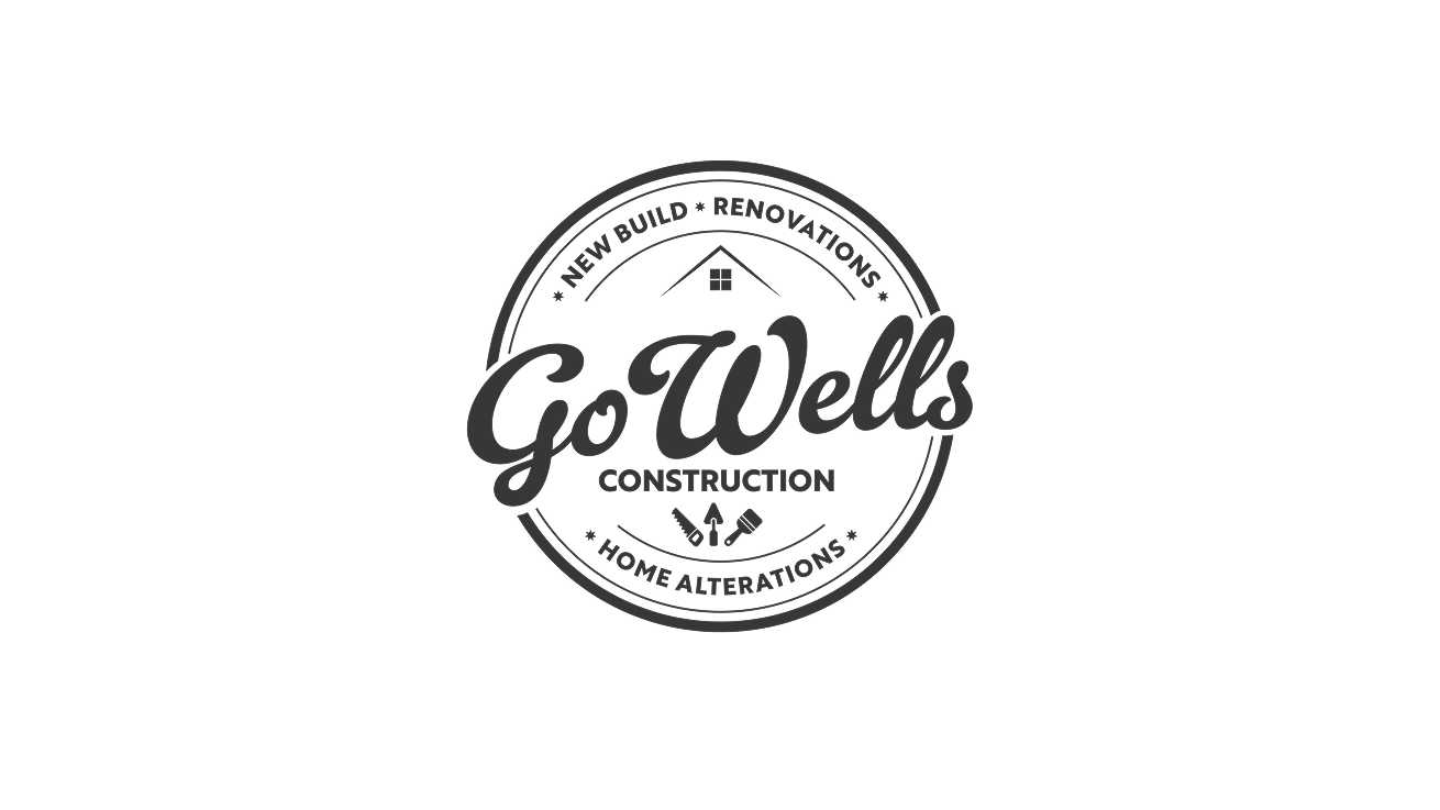
We began by analysing the AI-generated draft and identifying what worked and what didn’t. The circular badge format had potential, but the composition needed simplification and stronger visual hierarchy.
Refined Structure & Balance
We redesigned the layout to create a clean, symmetrical badge that feels intentional and professional. The typography was completely refined, ensuring “GoWells” became the dominant, confident focal point, supported clearly by “Construction” and supporting descriptors.
Subtle Architectural Reference
Rather than using a literal house icon, we incorporated a minimal, understated building reference within the badge structure. This preserved the construction connection without falling into cliché territory.
Cleaner Visual Language
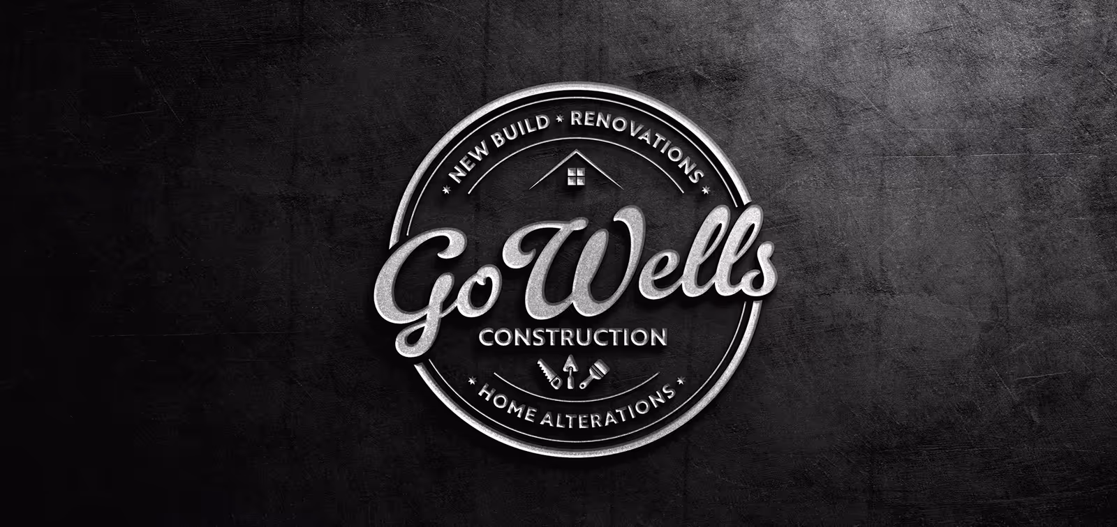
The AI draft included excessive detailing and cluttered tool illustrations. We simplified the iconography, refined the line weights, and ensured the logo could scale effectively across different applications, from vehicle livery to embroidered workwear.
Timeless, Monochrome Foundation
The refined logo was designed in a strong monochrome style to ensure versatility, recognisability, and ease of use across print and digital formats.